User Experience Design for Technical Documentation
We are not our users and it is always important in the development of documentation to consider the perspective of the end user. Just because it makes sense to us, does not mean it will make sense to someone else. User Experience Design is a vital element of developing technical documentation.
User Experience Design – What Is It?
User Experience Design, also referred to as UX Design, is a process that design teams and writers use to create products that are meaningful and relevant for users. UX Design puts the developer in the shoes of different users, to consider what will be useful and impactful.

Three Questions to Consider
- Who is my end user?
- Who am I designing, developing, or writing for?
- How am I going to help my end user?
Ethos / Logos / Pathos
When creating anything related to user experience design, or writing in general, your users are trusting you! Ethos, Logos, and Pathos are three strategies commonly used to appeal to an audience and each have an important role.
Ethos appeals to credibility and trustworthiness. It is often displayed through confidence in delivery and citing credible sources.
Logos is all about logic and reason, or providing proof. Examples of the use of Logos include references to studies or statistics, as well as comparisons, analogies, and metaphors.
Pathos emphasizes the importance of appealing to emotions. Pathos is often used by telling stories, using vivid language, or including inspirational quotes.
Design Basics
Below, we outline the basic principles used in UX Design and how they can be utilized in technical documentation.
Drafting & Drawing
Create drafts and proofs of concepts to generate content structures, develop new ideas visually, and take constructive criticism.
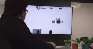
- Map the content to consider process flows in a way that makes sense.
- Draft! Nobody creates something perfect on the first try. It’s okay to make mistakes and we learn from them! Keep drafting!
- Draw out your design with a pen and paper, photoshop, or using Powerpoint.
Content Placement
Where will the content be placed? It is important that the content is readable. You don’t want things floating around without a purpose. Make your content memorable!
Consider these questions when arranging your content:
- What does the user need to know in this section?
- Do I need to include interactive elements, such as roll-over functions or hotspots?
- How does the information flow?
Information Flow
The flow of information should be determined and developed early on.

- Does the information make sense?
- Can someone visiting or using this for the first time find what they need?
- Can they navigate back?
Including bookmarks, tables of content, site maps, navigation, and search functionalities provide important tools to users as they navigate your content.
Color Schemes
Use colors that make your content readable and easy to understand. Don’t use colors that blend into the background.
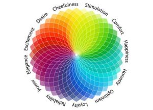
It is important to consider psychology as it relates to UX Design and the colors that you’re using. Through research, it has been found that colors have meanings and create impact whether we know it or not. Color combinations also have different meanings and it is important to consider how these colors will be interpreted in different cultures.
Follow the 60-30-10 Rule. One color makes up 60% of the design, a complimentary color makes up 30% of a design, and a third color is used to make up 10%. This rule balances the color used in design.
For more information on psychology and color in UX Design, read “The Role of Color in UX” by Cameron Chapman here.
Fonts & Typefaces
Understand the significance of fonts and typefaces that are used in content design. Their use impacts the readability and usability of the content. When used effectively, typeface enhances usability, catches users’ attention, and can potentially increase conversion rates.
Serif vs. Sans Serif vs. Decorative
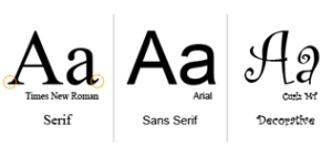
A serif is a stroke connected to the ends of some typefaces. Serif fonts are often used in print, as the stroke helps guide the reader from letter to letter.
A sans serif is a typeface without strokes or extra elements on the letters. Sans serif fonts are the preferred most for digital platforms.
A decorative font is a highly decorated or designed version of serif and sans serif typefaces. Decorative fonts are discouraged, as they are not always readable.
Testing
 Do not assume that your content is perfect on the first run. Everyone makes mistakes! Click through your content, check your spelling and grammar, and be sure that the content is correct and in the right place. It is important to test everything before moving forward.
User Experience Design is not…
… a way to openly critique others or turn down new ideas. A negative attitude regarding users will lead to lackluster content and functionality.
… a concrete way of doing things. All users have different wants and needs and it is important to be flexible and open to new ideas.
… a way of excluding others in conversation. Although someone may not be an expert, everyone should have an opportunity to have a say.
… a way to trick users into doing something. Our users are the most important factor and reason why we build and design.